Gotedo User Interface Overview
The Gotedo Software was built with mobile first design. This ensures that all pages of the software renders correctly on mobile devices and desktop screens.
While you can use mobile devices such as phones to access the Gotedo software, it is highly recommended that you make use of desktop/laptops to access the application for the highest productivity.
Overview
The User Interface (UI) of the Gotedo software is divided into five main sections:
- Menu Sidebar,
- Header, and
- Content Area
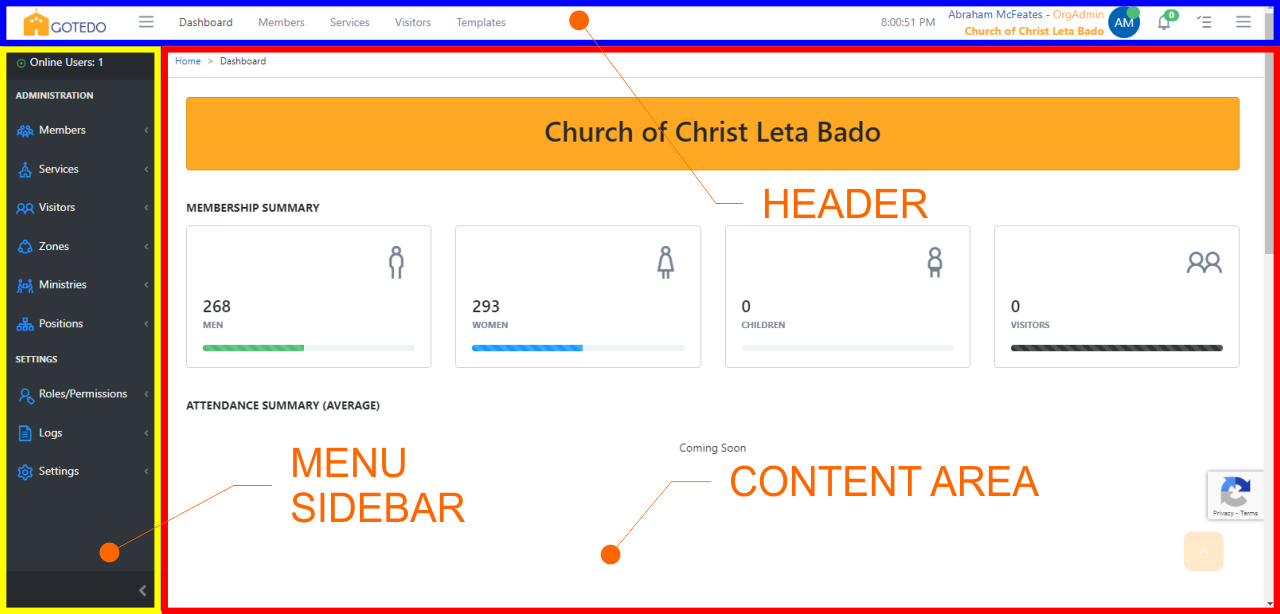
Menu Sidebar
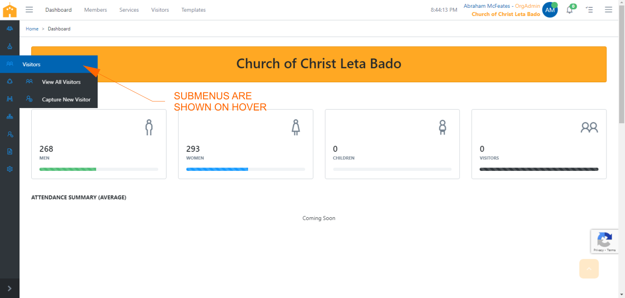
The Menu Sidebar is the main area for navigating around the application. It contains links to all areas of the application. It is divided into two sections: Administration and Settings.
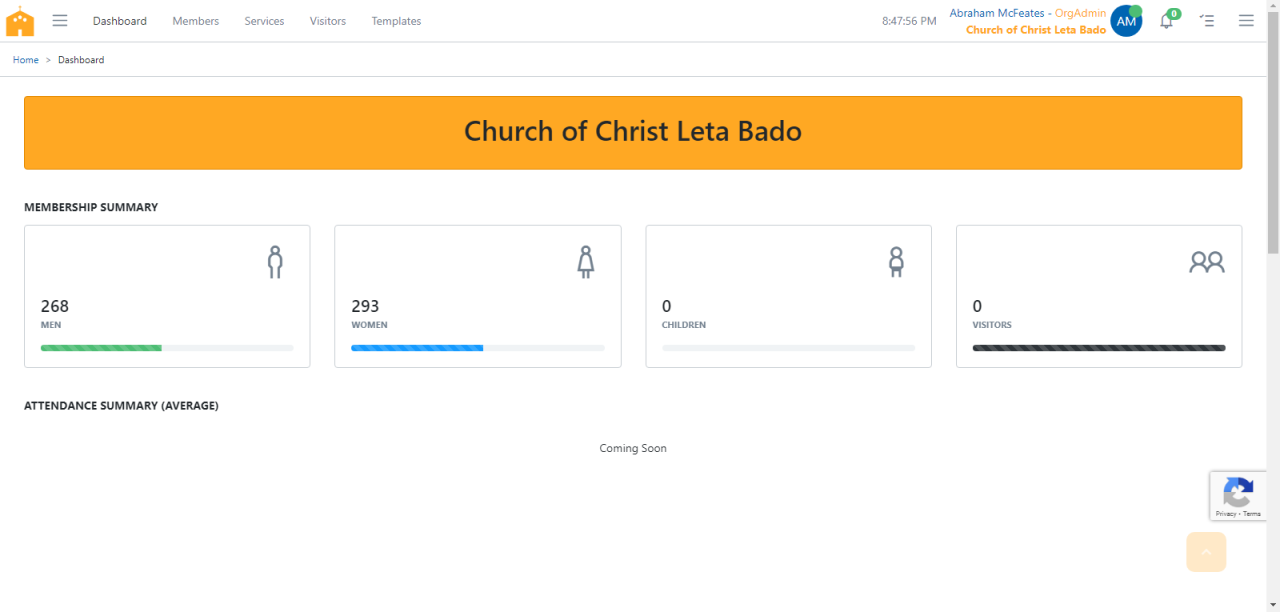
On the deskop mode, the Menu Sidebar can be collapsed to provide a wider Content Area. There are two modes: partial and total collapse modes.
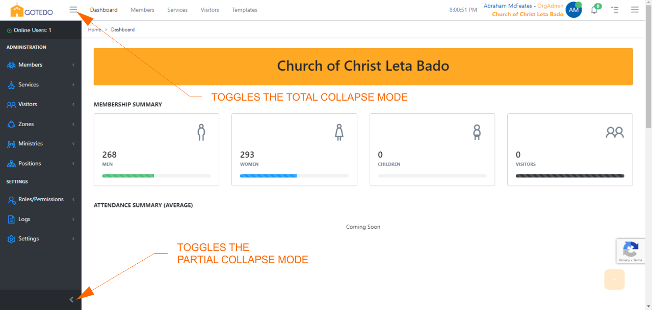
Partial Collapse Mode
In the partial collapse mode, the menu sidebar is minimised to show only icons. To use the partial collapse mode, click the minimise button at the bottom of the menu sidebar. Hovering over the icons will show the hidden submenus.
Total Collapse Mode
In the total collapse mode, the entire sidebar is collapsed and hidden from view. To use the total collapse mode, click the menu button by the right side of the logo.
Header
The User Interface Header of the Gotedo software is divided into following areas:
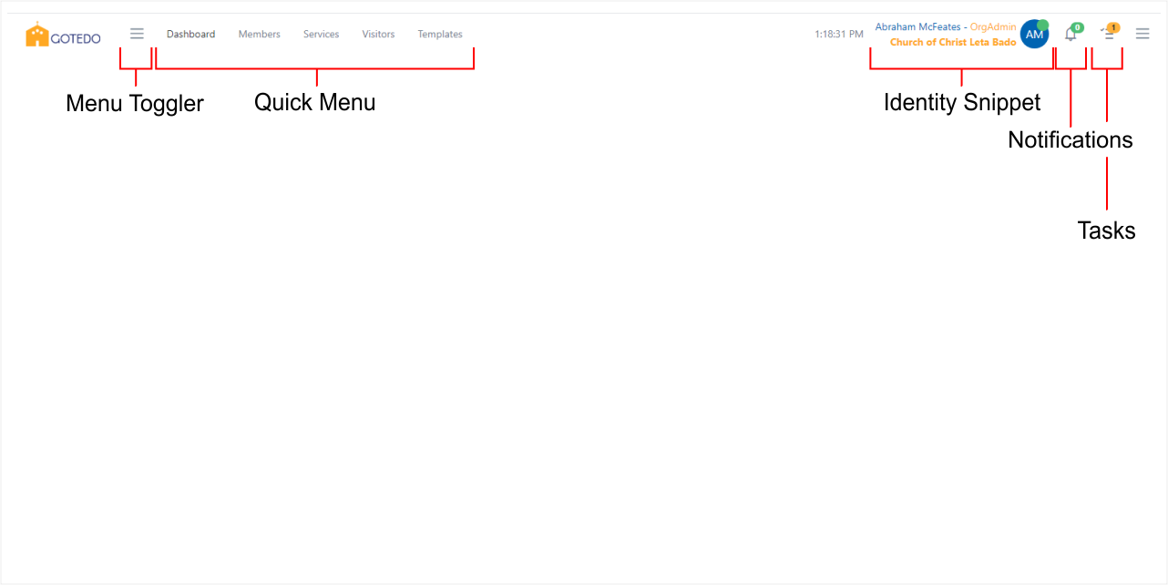
- Logo,
- Menu switcher/toggler,
- Quick menu,
- Clock,
- Identity snippet,
- Notifications icon, and
- Tasks icon.
The areas of the header worthy of discussing are:
Quick Menu
The quick menu offers shortcut to frequently-used functionalities such as the dashboard, membership list, visitors' list, services, and church templates.
Clock
The clock area obviously shows the logged-in member's current local time. But it also indicates the current local date when you hover over it.
Identity Snippet
The Identity Snippet shows a summary the logged-in member's identity. The following information is shown at a glance:
- Name of the logged-in member,
- Role of the logged-in member,
- The logged-in member's church name,
- Logged-in member's avatar (profile picture or initials, if no profile picture is available),
- Network status indicator.
The following actions are available within the Identity Snippet:
- Clicking on the name of logged-in member navigates to the logged-in member's profile.
- Clicking on the name of church navigates to the church profile.
- Clicking on the avatar opens the drawer where the Logout function can be found.
Notifications icon
The Notifications icon shows the number of unread notifications. Clicking on the Notifications icon opens the notification drawer which shows the first five notifications and a link to navigate to the notification page.
Tasks icon
The Tasks icon shows the number of pending tasks. Clicking on the Tasks icon opens the Tasks drawer which shows the completed and pending tasks for your church. It is useful for knowing your progress in setting up your church backend.